ラベル Chartify の投稿を表示しています。 すべての投稿を表示

2020年9月20日日曜日

Jupyter上でChartifyを使用してヒストグラムを表示する

Jupyter上でChartifyを使用してヒストグラムを表示するには、以下のサンプルのようにhistogramを使用します。

サンプルコード

import chartify
import pandas as pd

chart_data = chartify.examples.example_data()
print(chart_data)

ch = chartify.Chart(blank_labels=True, y_axis_type='density')
ch.set_title("ヒストグラムサンプル")
ch.plot.histogram(data_frame=chart_data, values_column='total_price', bins=20)
ch.show()

〇出力画像

インストール方法

Jupyterの仮想環境で以下のコマンドを実行します。
pipenv install chartify

関連情報

・Chartifyのgithubリポジトリ
https://github.com/spotify/chartify

2020年9月19日土曜日

Jupyter上でChartifyを使用してテキストグラフを表示する

Jupyter上でChartifyを使用してテキストグラフを表示するには、以下のサンプルのようにtextを使用します。テキストグラフは、散布図のようにマーカーではなくテキストを表示します。
テキストだけだと分かりにくいので下記の例では分布図とテキストグラフを重ねて点も表示するようにしています。
font_sizeで文字サイズ、angleで角度、x_offset/y_offsetでオフセットを指定できます。

サンプルコード

import chartify

data = chartify.examples.example_data()
chart_data = data.groupby(['fruit'])[['quantity', 'total_price']].sum().reset_index()
print(chart_data)

ch = chartify.Chart(blank_labels=True, x_axis_type='linear', y_axis_type='linear')
ch.set_title("テキストグラフサンプル")
ch.plot.text(data_frame=chart_data, x_column='total_price', y_column='quantity', 
    text_column='fruit', color_column='fruit', angle=-30, font_size='12pt', x_offset=1, y_offset=-5)
ch.style.color_palette.reset_palette_order()
ch.plot.scatter(
    data_frame=chart_data,
    x_column='total_price',
    y_column='quantity',
    color_column='fruit')
ch.set_legend_location("outside_bottom")
ch.show()

〇出力画像

インストール方法

Jupyterの仮想環境で以下のコマンドを実行します。
pipenv install chartify

関連情報

・Chartifyのgithubリポジトリ
https://github.com/spotify/chartify

2020年9月18日金曜日

Jupyter上でChartifyを使用して散布図を表示する

Jupyter上でChartifyを使用して散布図を表示するには、以下のサンプルのようにscatterを使用します。
markerでマーカーの形を変更する事ができます(asterisk, circle, circle_cross, circle_x, cross, diamond, diamond_cross, hex, inverted_triangle, square, square_x, square_cross, triangle, x, *, +, o, ox, o+)。

サンプルコード

import chartify
import pandas as pd

chart_data = chartify.examples.example_data()
print(chart_data)

ch = chartify.Chart(blank_labels=True, x_axis_type='datetime', y_axis_type='linear')
ch.set_title("散布図サンプル")
ch.plot.scatter(data_frame=chart_data, x_column='date', y_column="total_price", 
    size_column='total_price', color_column='fruit', marker='asterisk')
ch.show()

〇出力画像

インストール方法

Jupyterの仮想環境で以下のコマンドを実行します。
pipenv install chartify

関連情報

・Chartifyのgithubリポジトリ
https://github.com/spotify/chartify

2020年9月17日木曜日

Jupyter上でChartifyを使用して積上げ領域グラフを表示する

Jupyter上でChartifyを使用して積上げ領域グラフを表示するには、以下のサンプルのようにareaを使用します。
StackedをFalseにすると積み上げでない領域グラフになります。

サンプルコード

import chartify
import pandas as pd

data = chartify.examples.example_data()
data['month_year'] = data['date'].values.astype('datetime64[M]')
chart_data = data.groupby(['fruit', 'month_year'])[['quantity']].sum().reset_index()
print(chart_data)

ch = chartify.Chart(blank_labels=True, x_axis_type='datetime', y_axis_type='linear')
ch.set_title("領域グラフサンプル")
ch.plot.area(data_frame=chart_data, x_column='month_year', y_column='quantity', color_column='fruit', stacked=True)
ch.show()

〇出力画像

インストール方法

Jupyterの仮想環境で以下のコマンドを実行します。
pipenv install chartify

関連情報

・Chartifyのgithubリポジトリ
https://github.com/spotify/chartify

2020年9月16日水曜日

Chartifyを使用した折れ線グラフの線を点線や破線に設定する

Chartifyを使用した折れ線グラフの線を点線や破線に設定するには、以下のサンプルのようにline_dashを使用します。
dashedで破線・dottedで点線になります。

サンプルコード

import chartify

data = chartify.examples.example_data()
chart_data = data.groupby(['country', 'date'])[['quantity']].sum().reset_index().query('country in ("JP")')
print(chart_data)

ch = chartify.Chart(blank_labels=True, x_axis_type='datetime', y_axis_type='linear')
ch.set_title("折れ線グラフサンプル")
ch.plot.line(data_frame=chart_data, x_column='date', y_column='quantity', color_column='country', line_dash='dotted')
ch.show()

〇出力画像

インストール方法

Jupyterの仮想環境で以下のコマンドを実行します。
pipenv install chartify

関連情報

・Chartifyのgithubリポジトリ
https://github.com/spotify/chartify

2020年9月15日火曜日

Chartifyを使用した折れ線グラフの線の幅を設定する

Chartifyを使用した折れ線グラフの線の幅を設定するには、以下のサンプルのようにline_widthを使用します(デフォルトは4です)。

サンプルコード

import chartify

data = chartify.examples.example_data()
chart_data = data.groupby(['country', 'date'])[['quantity']].sum().reset_index().query('country in ("US", "JP")')
print(chart_data)

ch = chartify.Chart(blank_labels=True, x_axis_type='datetime', y_axis_type='linear')
ch.set_title("折れ線グラフサンプル")
ch.plot.line(data_frame=chart_data, x_column='date', y_column='quantity', color_column='country', line_width=1)
ch.show()

〇出力画像

インストール方法

Jupyterの仮想環境で以下のコマンドを実行します。
pipenv install chartify

関連情報

・Chartifyのgithubリポジトリ
https://github.com/spotify/chartify

2020年9月14日月曜日

Jupyter上でChartifyを使用して折れ線グラフを表示する

Jupyter上でChartifyを使用して折れ線グラフを表示するには、以下のサンプルのようにlineを使用します。

サンプルコード

import chartify

data = chartify.examples.example_data()
chart_data = data.groupby(['fruit', 'date'])[['quantity']].sum().reset_index()
print(chart_data)

ch = chartify.Chart(blank_labels=True, x_axis_type='datetime', y_axis_type='linear')
ch.set_title("折れ線グラフサンプル")
ch.plot.line(data_frame=chart_data, x_column='date', y_column='quantity', color_column='fruit')
ch.show()

〇出力画像

インストール方法

Jupyterの仮想環境で以下のコマンドを実行します。
pipenv install chartify

関連情報

・Chartifyのgithubリポジトリ
https://github.com/spotify/chartify

2020年9月13日日曜日

Jupyter上でChartifyを使用してヒートマップを表示する

Jupyter上でChartifyを使用してヒートマップを表示するには、以下のサンプルのようにheatmapを使用します。

サンプルコード

import chartify

data = chartify.examples.example_data()
chart_data = data.groupby(['country', 'fruit'])[['quantity']].sum().reset_index()
print(chart_data)

ch = chartify.Chart(blank_labels=True, x_axis_type='categorical', y_axis_type='categorical')
ch.set_title("ヒートマップサンプル")
ch.plot.heatmap(data_frame=chart_data, x_column='fruit', y_column='country', 
    text_column='quantity', color_column='quantity', text_format='{:}')
ch.show()

〇出力画像

インストール方法

Jupyterの仮想環境で以下のコマンドを実行します。
pipenv install chartify

関連情報

・Chartifyのgithubリポジトリ
https://github.com/spotify/chartify

2020年9月12日土曜日

Jupyter上でChartifyを使用してパラレルチャートを表示する

Jupyter上でChartifyを使用してパラレルチャートチャートを表示するには、以下のサンプルのようにparallelを使用します。

サンプルコード

import chartify

data = chartify.examples.example_data()
bar_data = data.groupby(['country', 'fruit'])[['quantity']].sum().reset_index()
print(bar_data)

ch = chartify.Chart(blank_labels=True, x_axis_type='categorical')
ch.set_title("パラレルチャート")
ch.plot.parallel(data_frame=bar_data, categorical_columns=['fruit'], numeric_column='quantity', color_column='country')
ch.show()

〇出力画像

インストール方法

Jupyterの仮想環境で以下のコマンドを実行します。
pipenv install chartify

関連情報

・Chartifyのgithubリポジトリ
https://github.com/spotify/chartify
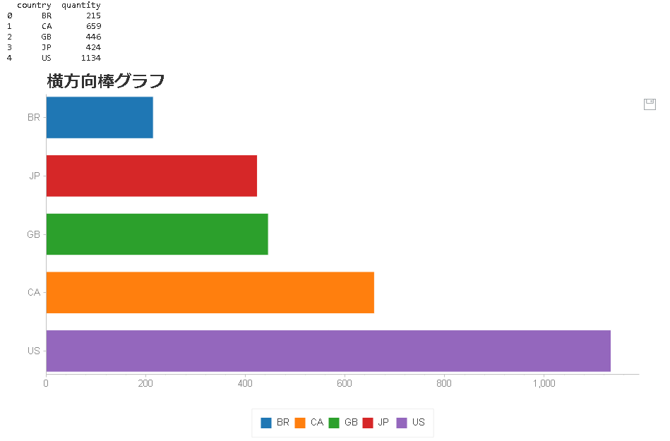
2020年9月11日金曜日

Jupyter上でChartifyを使用して横方向ロリポップチャートを表示する

Jupyter上でChartifyを使用して横方向ロリポップチャートを表示するには、以下のサンプルのようにlollipopを使用します。

サンプルコード

import chartify

data = chartify.examples.example_data()
bar_data = data.groupby('country')[['quantity']].sum().reset_index()
print(bar_data)

ch = chartify.Chart(blank_labels=True, y_axis_type='categorical')
ch.set_title("横方向ロリポップチャート")
ch.plot.lollipop(data_frame=bar_data, categorical_columns='country', numeric_column='quantity', color_column='country')
ch.show()

〇出力画像

インストール方法

Jupyterの仮想環境で以下のコマンドを実行します。
pipenv install chartify

関連情報

・Chartifyのgithubリポジトリ
https://github.com/spotify/chartify

2020年9月10日木曜日

Jupyter上でChartifyを使用して横方向積上げ棒グラフを表示する

Jupyter上でChartifyを使用して横方向積上げ棒グラフを表示するには、以下のサンプルのようにbar_stackedを使用します。

サンプルコード

import chartify

data = chartify.examples.example_data()
bar_data = data.groupby(['country', 'fruit'])[['quantity']].sum().reset_index()
print(bar_data)

ch = chartify.Chart(blank_labels=True, y_axis_type='categorical')
ch.set_title("横方向積上棒グラフ")
ch.plot.bar_stacked(data_frame=bar_data, categorical_columns='country', numeric_column='quantity',stack_column='fruit')
ch.show()


〇出力画像


インストール方法

Jupyterの仮想環境で以下のコマンドを実行します。
pipenv install chartify

関連情報

・Chartifyのgithubリポジトリ
https://github.com/spotify/chartify

2020年9月9日水曜日

Jupyter上でChartifyを使用してデータソースの文字列を設定する

Jupyter上でChartifyを使用してデータソースの文字列を設定するには、set_source_labelメソッドを使用します。

サンプルコード

import chartify

data = chartify.examples.example_data()
bar_data = data.groupby('country')[['quantity']].sum().reset_index()
print(bar_data)

ch = chartify.Chart(blank_labels=True, y_axis_type='categorical')
ch.set_title("横方向棒グラフ")
ch.plot.bar(data_frame=bar_data, categorical_columns='country', numeric_column='quantity', color_column='country')
ch.set_source_label("サンプルデータソース")
ch.show()


〇出力画像


インストール方法

Jupyterの仮想環境で以下のコマンドを実行します。
pipenv install chartify

関連情報

・Chartifyのgithubリポジトリ
https://github.com/spotify/chartify

2020年9月8日火曜日

Jupyter上でChartifyを使用して凡例の位置を変更する

Jupyter上でChartifyを使用して凡例の位置を変更するには、set_legend_locationメソッドを使用します。

サンプルコード

import chartify

data = chartify.examples.example_data()
bar_data = data.groupby('country')[['quantity']].sum().reset_index()
print(bar_data)

ch = chartify.Chart(blank_labels=True, y_axis_type='categorical')
ch.set_title("横方向棒グラフ")
ch.plot.bar(data_frame=bar_data, categorical_columns='country', numeric_column='quantity', color_column='country')
ch.set_legend_location("outside_bottom")
ch.show()


〇出力画像


インストール方法

Jupyterの仮想環境で以下のコマンドを実行します。
pipenv install chartify

関連情報

・Chartifyのgithubリポジトリ
https://github.com/spotify/chartify

2020年8月22日土曜日

Jupyter上でChartifyを使用して縦方向ロリポップチャートを表示する

Jupyter上でChartifyを使用して縦方向ロリポップチャートを表示するには、以下のサンプルのようにlollipopを使用します。

サンプルコード

import chartify

data = chartify.examples.example_data()
bar_data = data.groupby('country')[['quantity']].sum().reset_index()
print(bar_data)

ch = chartify.Chart(blank_labels=True, x_axis_type='categorical')
ch.set_title("縦方向ロリポップチャート")
ch.plot.lollipop(data_frame=bar_data, categorical_columns='country', numeric_column='quantity', color_column='country')
ch.show()


〇出力画像


インストール方法

Jupyterの仮想環境で以下のコマンドを実行します。
pipenv install chartify

関連情報

・Chartifyのgithubリポジトリ
https://github.com/spotify/chartify

2020年8月21日金曜日

Jupyter上でChartifyを使用して縦方向積上げ棒グラフを表示する

Jupyter上でChartifyを使用して縦方向積上げ棒グラフを表示するには、以下のサンプルのようにbar_stackedを使用します。

サンプルコード

import chartify

data = chartify.examples.example_data()
bar_data = data.groupby(['country', 'fruit'])[['quantity']].sum().reset_index()
print(bar_data)

ch = chartify.Chart(blank_labels=True, x_axis_type='categorical')
ch.set_title("縦方向積上棒グラフ")
ch.plot.bar_stacked(data_frame=bar_data, categorical_columns='country', numeric_column='quantity',stack_column='fruit')
ch.show()


〇出力画像


インストール方法

Jupyterの仮想環境で以下のコマンドを実行します。
pipenv install chartify

関連情報

・Chartifyのgithubリポジトリ
https://github.com/spotify/chartify

Jupyter上でChartifyを使用して副題の文字列を設定する

Jupyter上でChartifyを使用して副題の文字列を設定するには、set_subtitleメソッドを使用します。

サンプルコード

import chartify

data = chartify.examples.example_data()
bar_data = data.groupby('country')[['quantity']].sum().reset_index()
print(bar_data)

ch = chartify.Chart(blank_labels=True, y_axis_type='categorical')
ch.set_title("横方向棒グラフ")
ch.set_subtitle("サンプル副題")
ch.plot.bar(data_frame=bar_data, categorical_columns='country', numeric_column='quantity', color_column='country')
ch.show()


〇出力画像


インストール方法

Jupyterの仮想環境で以下のコマンドを実行します。
pipenv install chartify

関連情報

・Chartifyのgithubリポジトリ
https://github.com/spotify/chartify

2020年8月20日木曜日

Jupyter上でChartifyを使用して凡例を非表示にする

Jupyter上でChartifyを使用して凡例を非表示にするには、set_legend_locationメソッドにNoneを渡します。

サンプルコード

import chartify

data = chartify.examples.example_data()
bar_data = data.groupby('country')[['quantity']].sum().reset_index()
print(bar_data)

ch = chartify.Chart(blank_labels=True, y_axis_type='categorical')
ch.set_title("横方向棒グラフ")
ch.plot.bar(data_frame=bar_data, categorical_columns='country', numeric_column='quantity', color_column='country')
ch.set_legend_location(None)
ch.show()


〇出力画像


インストール方法

Jupyterの仮想環境で以下のコマンドを実行します。
pipenv install chartify

関連情報

・Chartifyのgithubリポジトリ
https://github.com/spotify/chartify

Jupyter上でChartifyを使用して垂直方向の棒グラフを表示する

Jupyter上でChartifyを使用して垂直方向の棒グラフを表示するには、以下のコードを実行します。

サンプルコード

import chartify

data = chartify.examples.example_data()
bar_data = data.groupby('country')[['quantity']].sum().reset_index()
print(bar_data)

ch = chartify.Chart(blank_labels=True, x_axis_type='categorical')
ch.set_title("縦方向棒グラフ")
ch.plot.bar(data_frame=bar_data, categorical_columns='country', numeric_column='quantity', color_column='country')
ch.show()


〇出力画像


インストール方法

Jupyterの仮想環境で以下のコマンドを実行します。
pipenv install chartify

関連情報

・Chartifyのgithubリポジトリ https://github.com/spotify/chartify